A Chart Picks the Wrong Axis From a Table
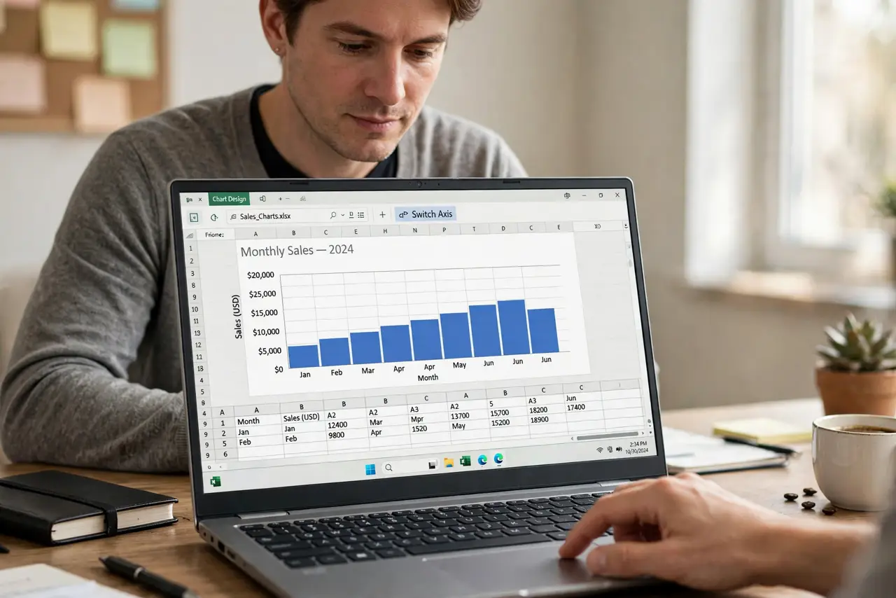
The chart puts months on the vertical axis and sales on the horizontal, which reads backwards. The app guessed the data layout wrong, and swapping the axes fixes it in seconds.
TL;DR / Quick Fix
Quick fix: select the chart and look for the switch row and column or switch axis option. Click it, check that categories now run along the bottom, and adjust the axis titles to match and update the axis titles to match.
Follow these steps
- Select the chart. Click the chart so its editing options appear. The axis controls only show when the chart is selected.
- Find the switch option. Look for switch row/column or switch axis in the chart menu. One click swaps which data runs along each axis.
- Check the categories sit at the bottom. Confirm text labels like months now run along the horizontal axis. Categories belong on the bottom in most business charts.
- Check the numbers run up the side. Confirm the numeric values run along the vertical axis. Numbers on the side is the layout readers expect.
- Fix the axis titles. Update the axis titles to match the new layout. A chart with swapped axes but old titles confuses everyone.
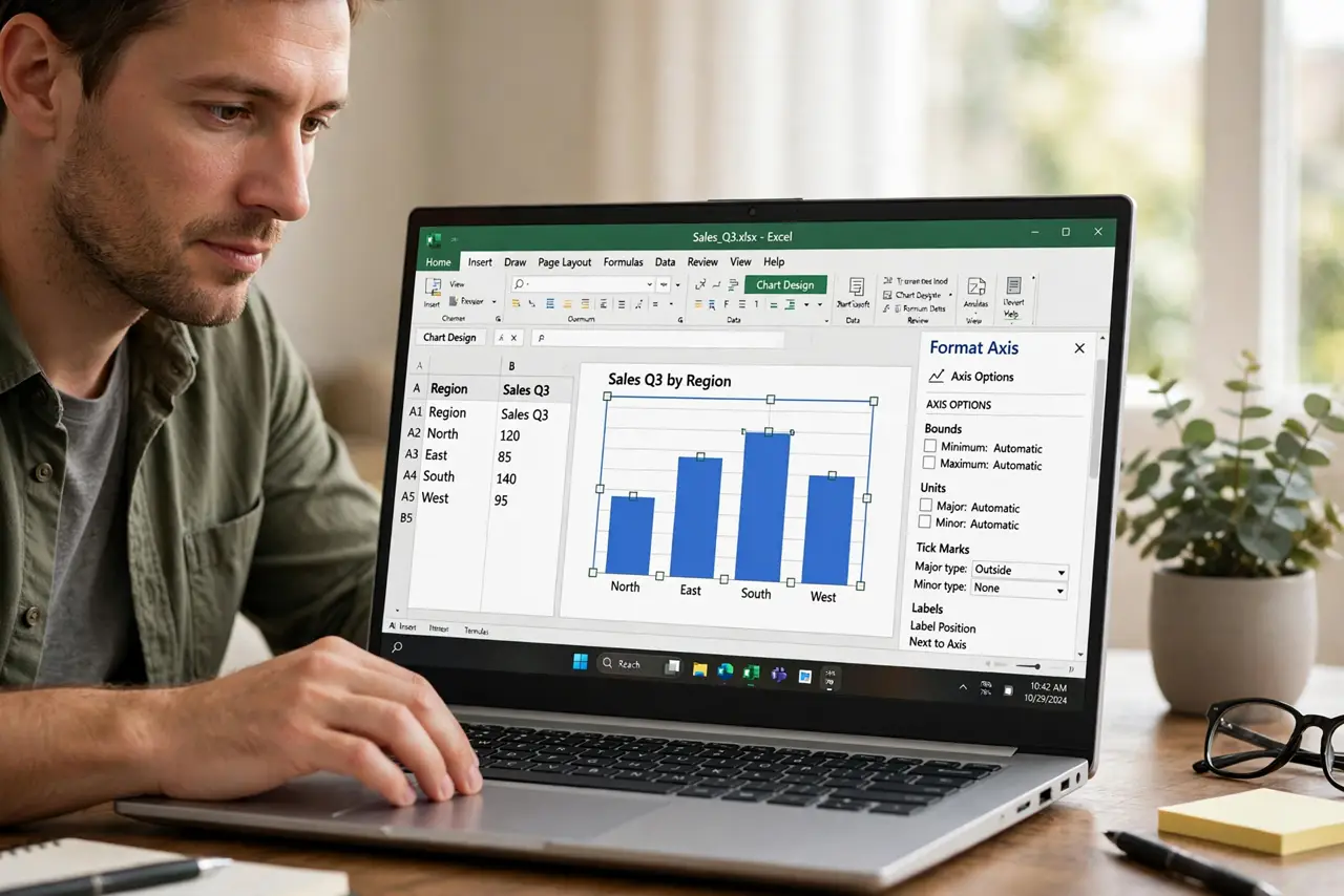
- Pick the right chart type. If swapping still looks wrong, try a bar chart instead of a column chart, or vice versa. The type should match the story the data tells.
What NOT to do
- Do not rebuild the chart from scratch. The switch option fixes most axis mistakes in one click.
- Do not leave the axes swapped. Readers expect categories on the bottom, and a backwards chart gets misread.
- Do not forget the axis titles. Swapped axes with old titles tell a contradictory story.
- Do not chart the raw table blindly. Select the right range first, since extra rows become extra nonsense on the chart.
Frequently asked questions
Why did my chart pick the wrong axis?
Because the app guessed the data layout from your selection, and the guess put categories where numbers belong.
How do I swap chart axes?
Select the chart and use the switch row/column or switch axis option in the chart menu.
Which axis should categories use?
The horizontal one in most cases, with numbers running up the vertical axis.